Showing posts with label design. Show all posts

Saturday, April 11, 2015

Goeiedag, Good News,

Hello hello hello, bonjour, guten tag and indeed goeiedag.


Reasons to be famous, completed projects and all sorts of illustrated high-jinks abound in this springtime season of newness and tidying.

A short while ago I made this first page of a comic about what Europe might be like in the future, and sent it along with a summary of the rest of the story to the nice people at Friedrich Naumann Stiftung for their Europe Fast Foward competition.

Along with six other comic artists I have been commissioned to complete the story and then go to Brussels for an awards ceremony and the launch of the book of our comics. Which is cool.


I'm not going to share the story with you, because I wouldn't want to spoil the surprise of what European culture will be like in the future. Because I am that prescient and clever that I have figured out what that will be. 
ALSO, I want to tell you that drawing lace is really enjoyable and I want more excuses to do so.  

In other comic news you can see a review of the second issue of Meanwhile... featuring my found text comic (Loved and Found, the serendipitous love story) on the Forbidden Planet blog here. Which is quite exciting. 


Also and as well, a somewhat longer time ago, the magnificent Christopher Kear of The New Tabloids commissioned me to produce some collagey artwork and designs for the album Good News including a full colour 12 page lyrics booklet in the found text style.


It is now a real thing in the real world and I went to the launch party although I think I missed my shout out which is a little bit embarrassing. 
The music sounded really good tho, you should check it out. 

Here are some of the lyric pages


I love the mix of serendipity and intention that is in all creativity but comes out especially much in abstract collage. The materials and colours that I used related to the theme and mood of each individual song, with a theme of using newsprint and jagged edges throughout, relating to the idea of the band's name and ethos of fractured journalism, commenting on modern life seen through the bottom of a broken bottle, dancing in the wreckage of the scene. You know, that sort of thing. Right? 


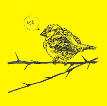
I've been doing lots of other fun drawings for fun and profit, much of which I am not sharing yet. But here are some sneaky, cheeky, peeky work in progress (or #wip to those in the know, or #itk) pictures from the new edition of What Birds are Really Thinking I am working on. 

It is going to be so so so good. Probably.


Sunday, June 1, 2014

Brown paper packages tied up with strings


You know my favourite things include but are not limited to, raindrops on roses, whiskers on kittens, hand drawn lettering, exciting fonts, maps, birds, fish, old cameras and people asking me to design their wedding invites using some or all of the previously mentioned. Horay!


Katie and Elliot came to me with the concept of the brown paper and mix of hand drawn fonts, and also with a lot of cute ideas for fitting in mini illustrations that relate to them and their interests - like the SLR camera film venue name because Katie is a photographer, and the oar and brown trout that reflect Elliot's rowing and fishing. I sketched out all the words and pictures separately, which made for easy editing to make different versions for the different time slots on the day.

some of the original drawings pre-photoshop.

I also got to do this great map design with detailed ink drawings of the key venues, hotels and local landmarks (like the pub where the couple met)


Some of the original drawings for the map. 

And here's our invite package unpacked, the concept for the talking heads image was slightly cheekily lifted from this design, but I replaced the 50s illustrations with portraits of Katie and Elliot, to make it more personal again. 


In fact the best thing about this project (apart from getting to do all of those favourite things) was how personal to the couple the designs were able to be. It was a great working process and we chatted a lot about ideas and layouts. Apologies for obvious sales spiel - but that's what you can get when you work with someone to design your own unique stationary rather than picking an existing template. 
IF you know what I mean. wink wink.  

The invites came out really well and I'm looking forward to doing some more work for this lovely couple for their big day this summer. In some ways similar, but so different from the designs I did for my own wedding stationary, which were also grounded in a big mix of lettering styles, but much more collagey and colourful:


If you think you might be interested in having me design some celebratory stationary for your event, please do drop me an email with your ideas and I'll make you some quotes. 

Strangely, I'm not that big on bright copper kettles or warm woolen mittens. 

Also, if anyone actually wanted to commission wedding invites that included drawings of kittens and roses, that actually would be the best commission ever.