Friday, April 24, 2015

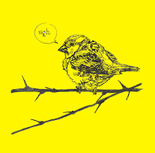
What Birds are REALLY Thinking...... 2!

Although I am trying to buy a flat in London with my husband and am therefore filled with a constant gut tearing terror and dispair, there are good and exciting things happening which are good and exciting. 

Mostly I am happy and excited that I have finished the second edition of What Birds Are Really Thinking. Here exclusively and for the first time I will show you some pictures. 


This has been in the pipeline for a while, moving between back and front burners to make way for aforementioned housing angst and other exciting projects such as those detailed in my last post.

The first edition of What Birds Are Really Thinking, including spoonbills thinking about Britney Spears and starlings thinking about soft furnishings is my all time bestselling thing that I have made (apart from the Magpies print). In addition to being one of the very first things I made after moving to London to seek my fortune as an illustrator back in 2008.

 And this edition is soooooooo much better.

 I decided to revisit the topic in 2015 as an excuse to make some multimedia work and draw birds (my favourite things) and as a promotional follow up to the launch of my new website (jennyrobins.com). Much as I have a fondness for the original zine, this second issue really does show how far I've come in terms of skill and design. I will be sending these out as a mailer in the next month with a few postcards I also have in the pipeworks. 

 If you fancy owning your own copy, they are available here, or pop me an email if you can think of a good reason why I should send you one for free.  

In other good news, the event June and I organised for the Big Draw back in October/November 2014 has won a runners up award in the Drawing Inspiration Awards. That's good eh? We are going to the awards ceremony and will probably wear nice dresses, definitely do some live drawing and possibly make a speech (appropriatness of speech not yet confirmed.) I've announced the news officially on the Storyhands site here


This is me taking a short break from running the Sketchbook Scavenger Hunt in my F(Art)S T-shirt. This is what it looks like to be AWARD WINNING. 


Saturday, April 11, 2015

Goeiedag, Good News,

Hello hello hello, bonjour, guten tag and indeed goeiedag.


Reasons to be famous, completed projects and all sorts of illustrated high-jinks abound in this springtime season of newness and tidying.

A short while ago I made this first page of a comic about what Europe might be like in the future, and sent it along with a summary of the rest of the story to the nice people at Friedrich Naumann Stiftung for their Europe Fast Foward competition.

Along with six other comic artists I have been commissioned to complete the story and then go to Brussels for an awards ceremony and the launch of the book of our comics. Which is cool.


I'm not going to share the story with you, because I wouldn't want to spoil the surprise of what European culture will be like in the future. Because I am that prescient and clever that I have figured out what that will be. 
ALSO, I want to tell you that drawing lace is really enjoyable and I want more excuses to do so.  

In other comic news you can see a review of the second issue of Meanwhile... featuring my found text comic (Loved and Found, the serendipitous love story) on the Forbidden Planet blog here. Which is quite exciting. 


Also and as well, a somewhat longer time ago, the magnificent Christopher Kear of The New Tabloids commissioned me to produce some collagey artwork and designs for the album Good News including a full colour 12 page lyrics booklet in the found text style.


It is now a real thing in the real world and I went to the launch party although I think I missed my shout out which is a little bit embarrassing. 
The music sounded really good tho, you should check it out

Here are some of the lyric pages


I love the mix of serendipity and intention that is in all creativity but comes out especially much in abstract collage. The materials and colours that I used related to the theme and mood of each individual song, with a theme of using newsprint and jagged edges throughout, relating to the idea of the band's name and ethos of fractured journalism, commenting on modern life seen through the bottom of a broken bottle, dancing in the wreckage of the scene. You know, that sort of thing. Right? 


I've been doing lots of other fun drawings for fun and profit, much of which I am not sharing yet. But here are some sneaky, cheeky, peeky work in progress (or #wip to those in the know, or #itk) pictures from the new edition of What Birds are Really Thinking I am working on. 

It is going to be so so so good. Probably.